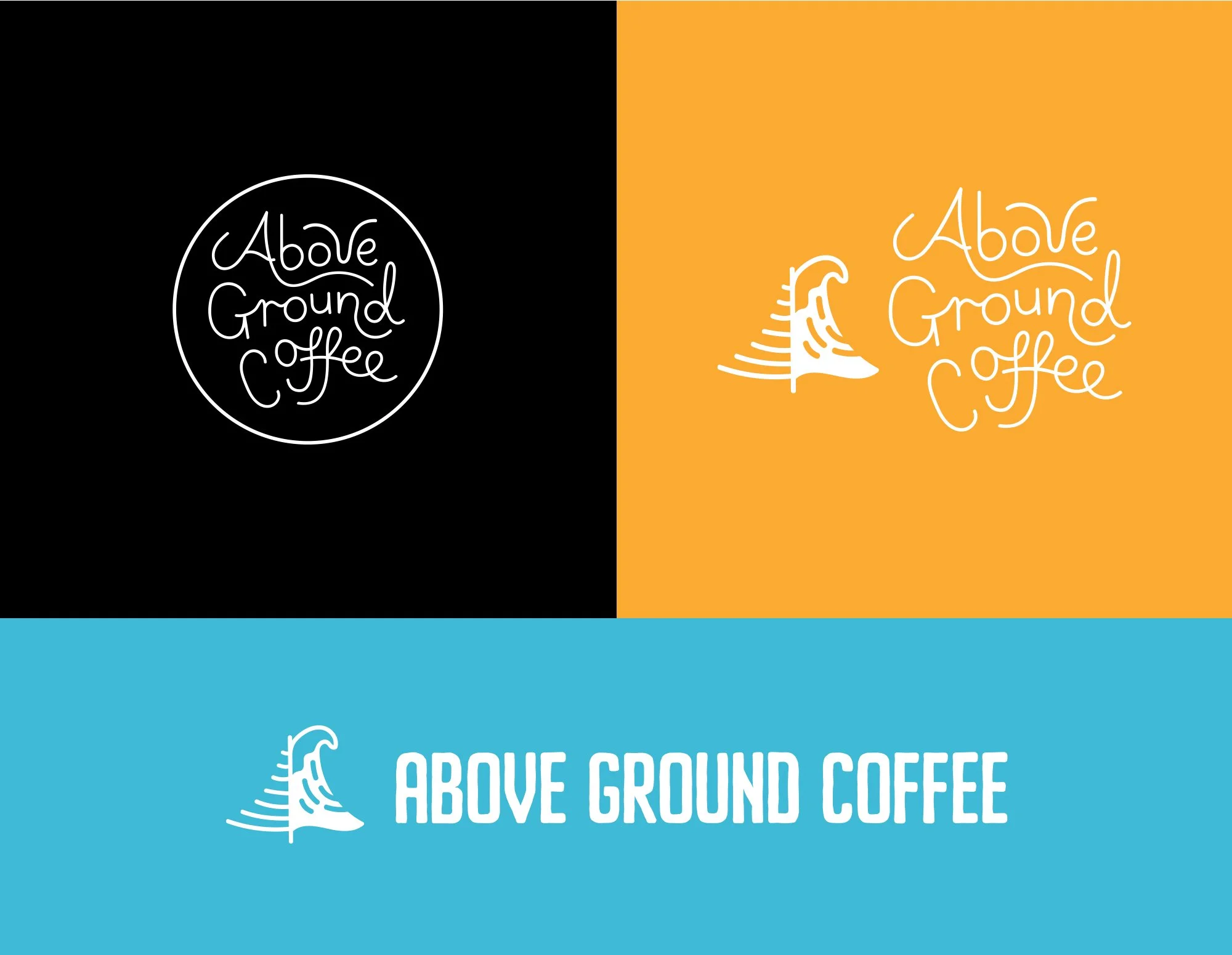
Above Ground Coffee
BRIEF:
A full rebrand including brand strategy and brand visuals for a roastery in coastal Shellharbour, NSW.
New logo set including colours and type choices that better represent who they are. They’re also needing new package designs for their current coffee products.
PROBLEM:
Above Ground Coffee wanted to develop their brands identity and stand out from their competition. They want to attract the right type of audience and gain more loyal returning customers. Plan to expand the business over the next 1-5 years without losing touch with their current customers and build a strong presence within the coffee community.

Solution:
A strong, versatile logo suite with including an iconic symbol that can be used across all of the brands touchpoints and applications. During our brand strategy session, we uncovered the brands values, mission and audience, enabling us to develop meaningful designs with purpose. The lettering for the logo was hand drawn including the ‘Pinewave’ symbol, which represents the iconic Norfolk pines in the area and the surf culture.


